
challenge
The digital experience was fragmented. Live matches were hard to find and repeat engagement was low.
outcome
A unified experience that puts live play first and makes discovery easier.

IMPACT
50%
increase in first-time engagement40%
increase in returning visitors1.4%
decrease in bounce rateTHE QUESTION
How does one of the oldest sports governing bodies stay relevant?
THE SHIFT
The real issue uncovered was content and audience archetypes not aligning. USPA serves multiple distinct audiences, each with their own journey. Getting both right was the only path to a cohesive experience.
A stakeholder workshop aligned the team around what mattered most. Sharing a prioritized framework opened the conversation, built trust, and gave the client a clear picture of where we were headed before a single component was designed.
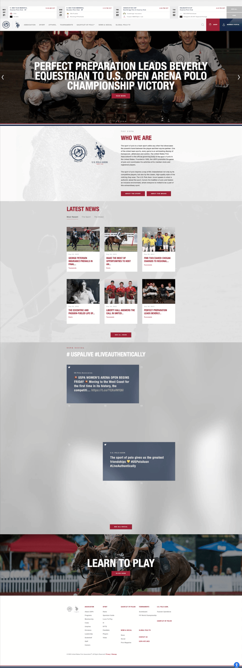
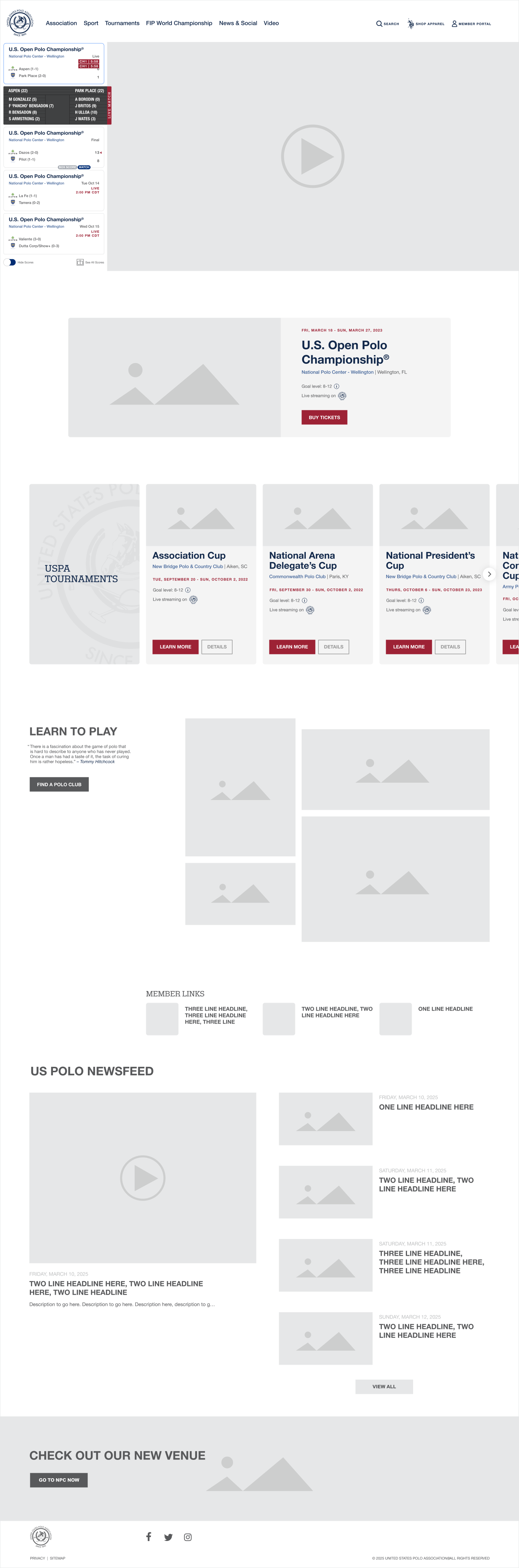
A feature carousel was removed and replaced with a live stream of a match. Who we are content and the social media feed were removed. Tournaments, learn to play, and the newsfeed were rebuilt with a modern system.

WHAT WE DID
Built around what's live and designed to work as one system. A match stream puts live sport front and center.
Live scores deliver players and context in real time.
A streamlined newsfeed keeps the audience connected between events.


THE APPROACH
We modernized the experience while respecting the sport's heritage. Polo is both sport and lifestyle. Storytelling unified content, events, and commerce.
A shot of the National Polo Center becomes an invitation. Beautiful blue sky, palm trees, flowers grace the pathway to walk into.

WHY IT MATTERED
The system works seamlessly across mobile and desktop. Every component feels part of the same experience.
The audience finds scores, events, and live matches easily. And it all looks and feels unmistakably Polo.
Let’s build what’s next — together
Client — U.S. Polo Association
Role — Product Design Lead
Services — Product Design · Design Systems · Systems Thinking · E-commerce