
Challenge
Outdated credit card statements confused and frustrated customers and made it hard to understand balances, payments, and charges.
Outcome
A redesigned billing experience that clarified statement data and organized payment information around customer needs.
IMPACT
$12M
funding secured to scale the redesigned billing experience70%
increase in statement comprehension1
cohesive system spanning print and digital billingTHE QUESTION
How do you make a financial document make sense for the customer and the business?
what we found
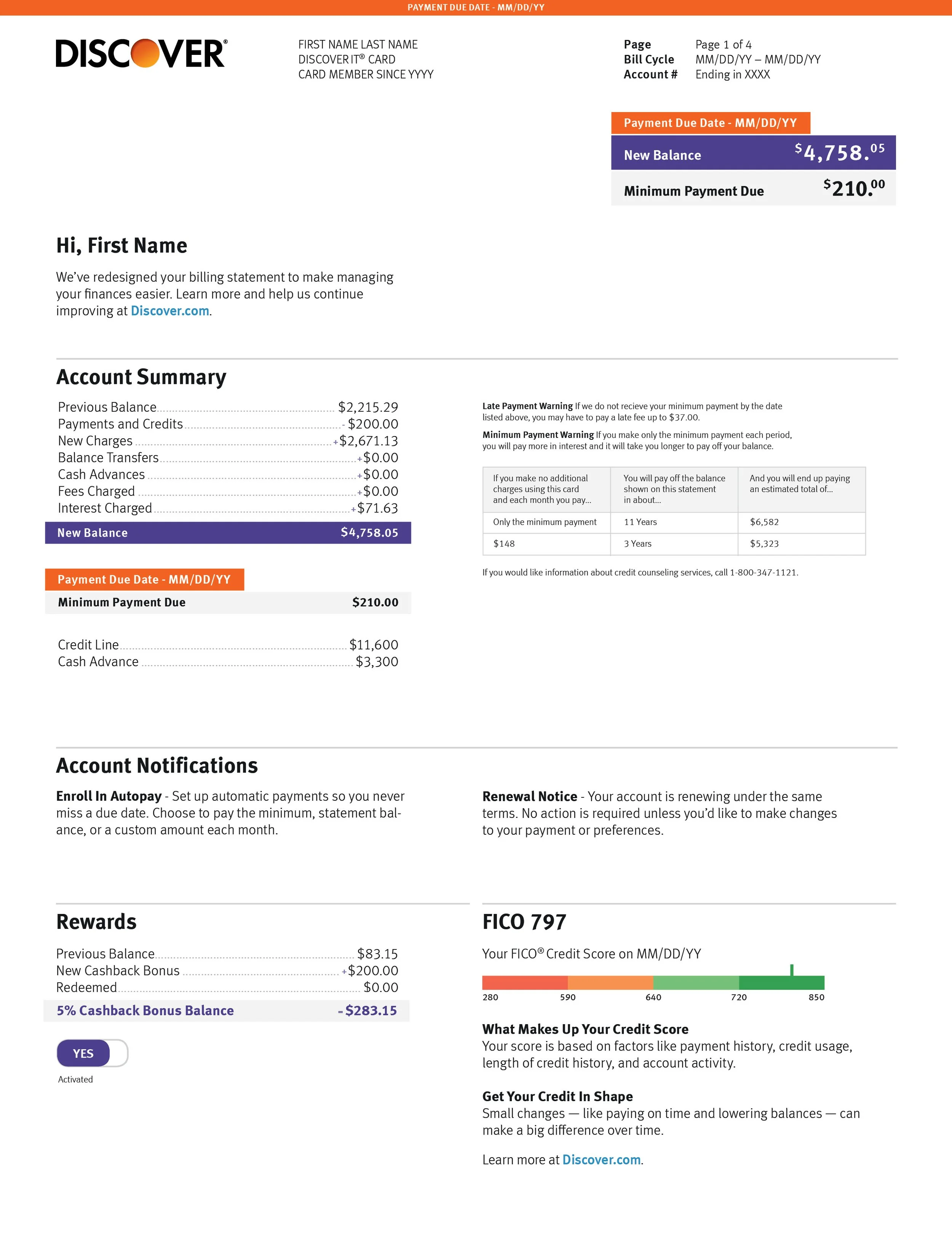
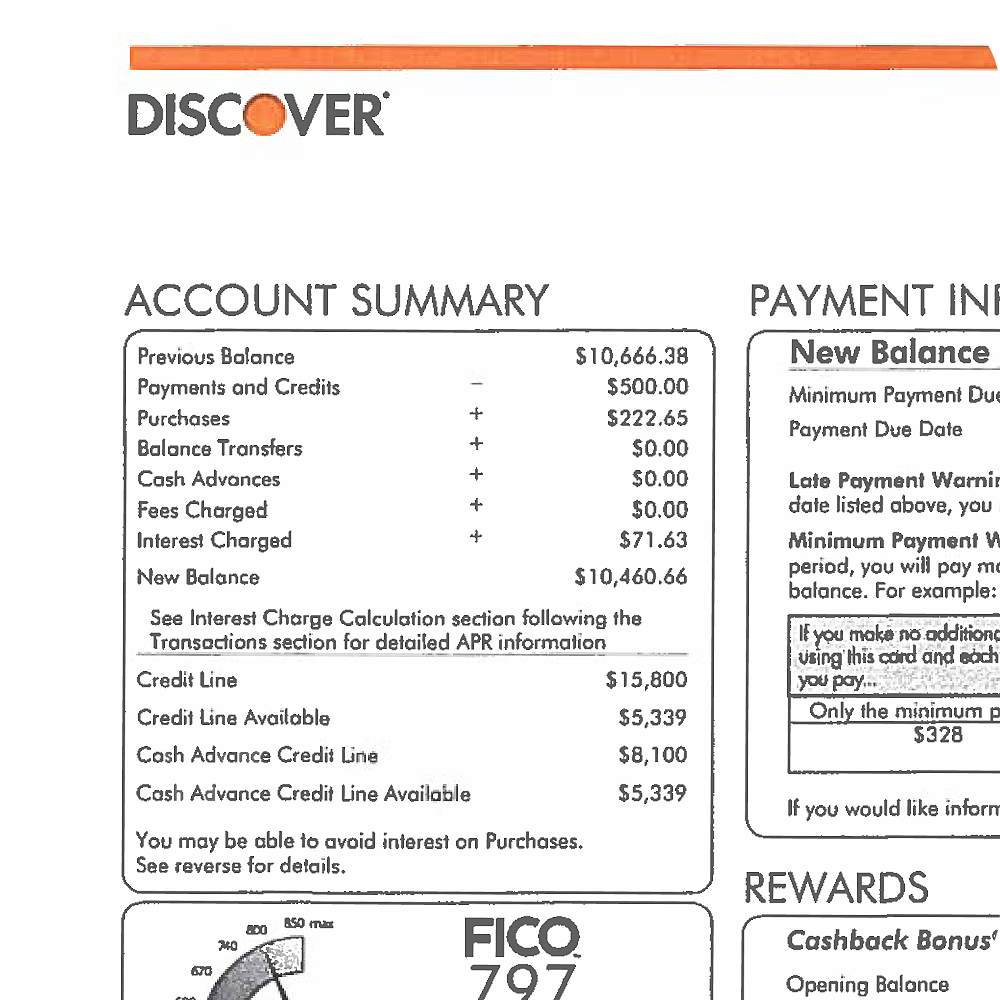
Research showed billing and payment were customers' highest priority for improvement. Statements were dense and overwhelming.
Customers couldn't quickly find what they owed, understand their charges, or see fees and interest clearly. They wanted tools to better manage their balance.
Redesigning the statement visually was one thing. The real opportunity was personalizing by archetype so customers could understand and tackle their balance.
what we did
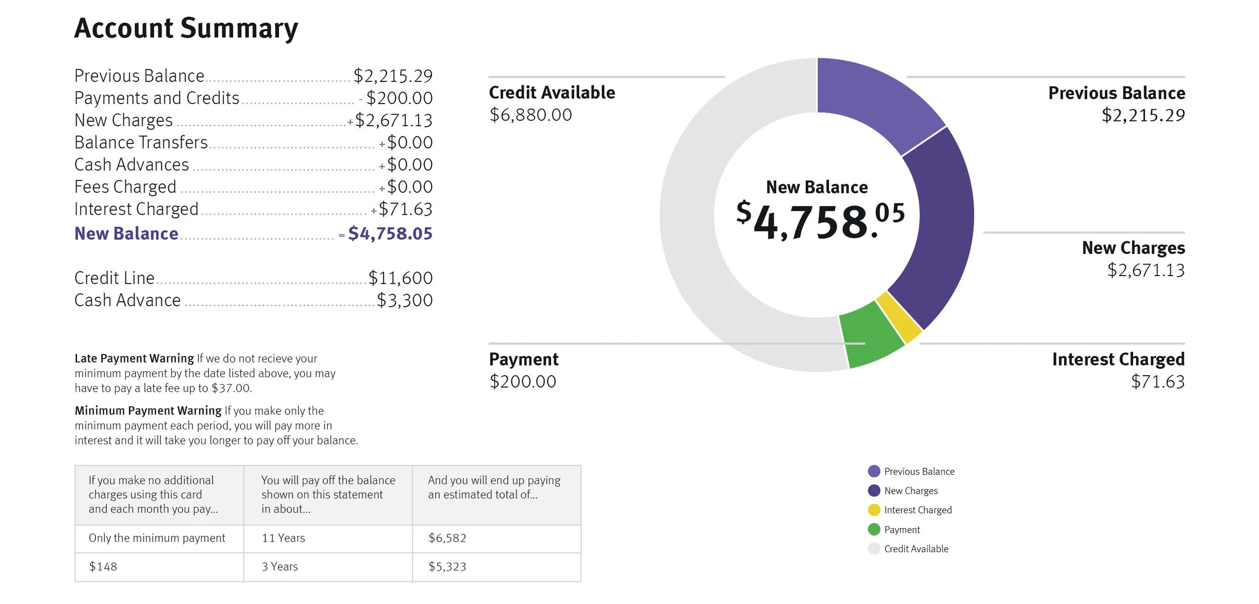
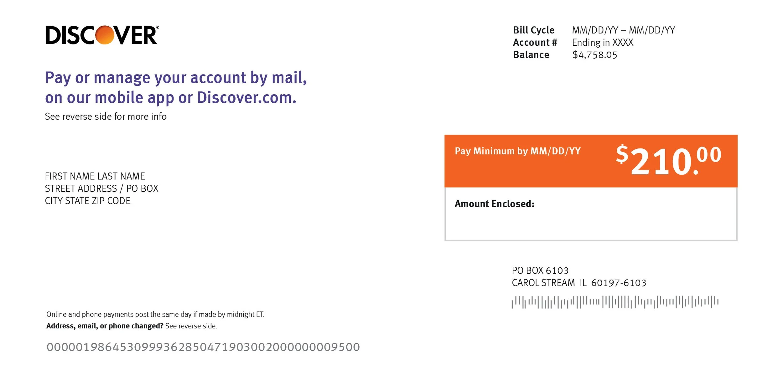
We reorganized around customer needs personalizing the statement to each archetype.
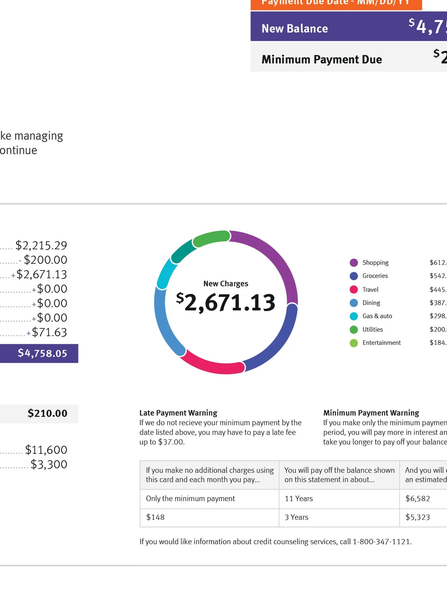
Data visualization was introduced to clarify how archetypes see charges, interest and payments.
A new layout gave information room to breathe lowering cognitive load.
why it mattered
Customers now finally understand their bills. They see what they owe and why. Support calls dropped.
Brand and product unite resulting in a cohesive design system across all touchpoints.
The approach personalized statements by behavioral archetype, giving customers the context they needed to pay off their bills and build financial responsibility.
Let’s build what’s next — together
Client — Discover
Role — Product Design Lead
Services — UX Strategy · Interaction Design · Information Architecture · Systems Thinking